Commerce & Brand Systems
VX Nexus
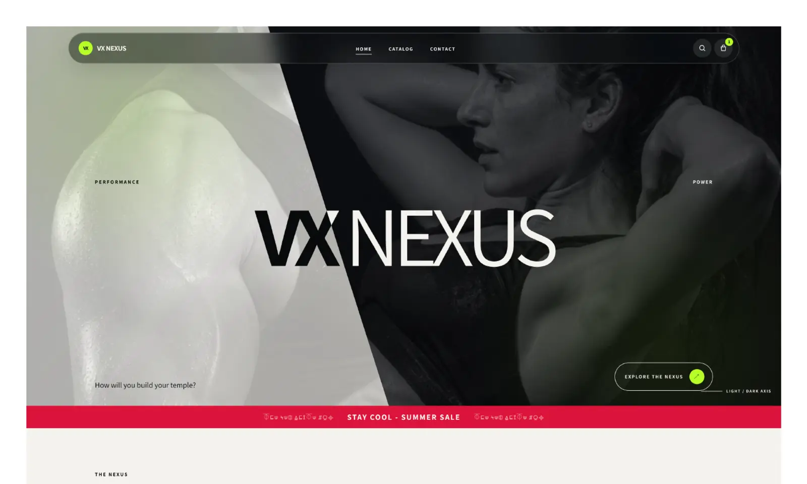
The project turns a mixed product catalog into a cohesive editorial world through monochrome composition, restrained accent color, strong typography, and organized product systems.
Context
The work in context.
A varied catalog needed a coherent identity and a product organization model that felt intentional.
Case study summary
What did Juan build?
An art-directed Shopify system connecting training, recovery, cooling, and everyday products.
This case study was last reviewed on .
Role, audience and objectives
Responsibility carried through the system.
Juan's role
- Brand and commerce strategy
- Art direction and visual system
- Shopify theme development
- Responsive storefront implementation
- Product naming, organization, payment, email, and domain setup
Audience
- People building training and recovery routines
- Shoppers comparing performance and everyday products
Objectives
- Create a distinctive editorial commerce language
- Connect products through a system rather than isolated listings
- Preserve clarity across dramatic light and dark sections
Behavioral lens
- Attention guided by hierarchy rather than visual pressure
- Continuity through a consistent product language
Context
VX Nexus connects training, recovery, cooling, and everyday wellness products through an editorial storefront rather than presenting them as an unrelated catalog.
Juan’s role
Juan handled brand direction, structure, visual design, Shopify theme development, responsive behavior, collections, payment setup, business email, domain configuration, and launch independently.
Visual direction
Monochrome photography, oversized type, warm-white and black fields, and a restrained green accent establish a clear identity. Product detail remains on calmer surfaces so the brand world does not reduce usability.
Information architecture and visual direction
Important structural decisions.
Information architecture
- Minimal global navigation
- Editorial category stories
- Product carousels and collections
- Training, recovery, cooling, and essentials
Design decisions
- Built a split light-and-dark visual axis
- Used neon green selectively for orientation and emphasis
- Balanced oversized typography with quieter product detail
Technical implementation
Infrastructure, responsive behavior, and access.
Email, forms, payments and platform
- Shopify storefront
- Custom theme development
- Collections and product system
- Payments, business email, domain configuration, and launch
Accessibility and responsive design
- Accent color is not the only state indicator
- High-contrast content surfaces
- Responsive product controls
Reflection
What the project clarified.
Strong art direction works best when it gives a catalog a legible idea—not when it competes with the products.